

STUDIO 301
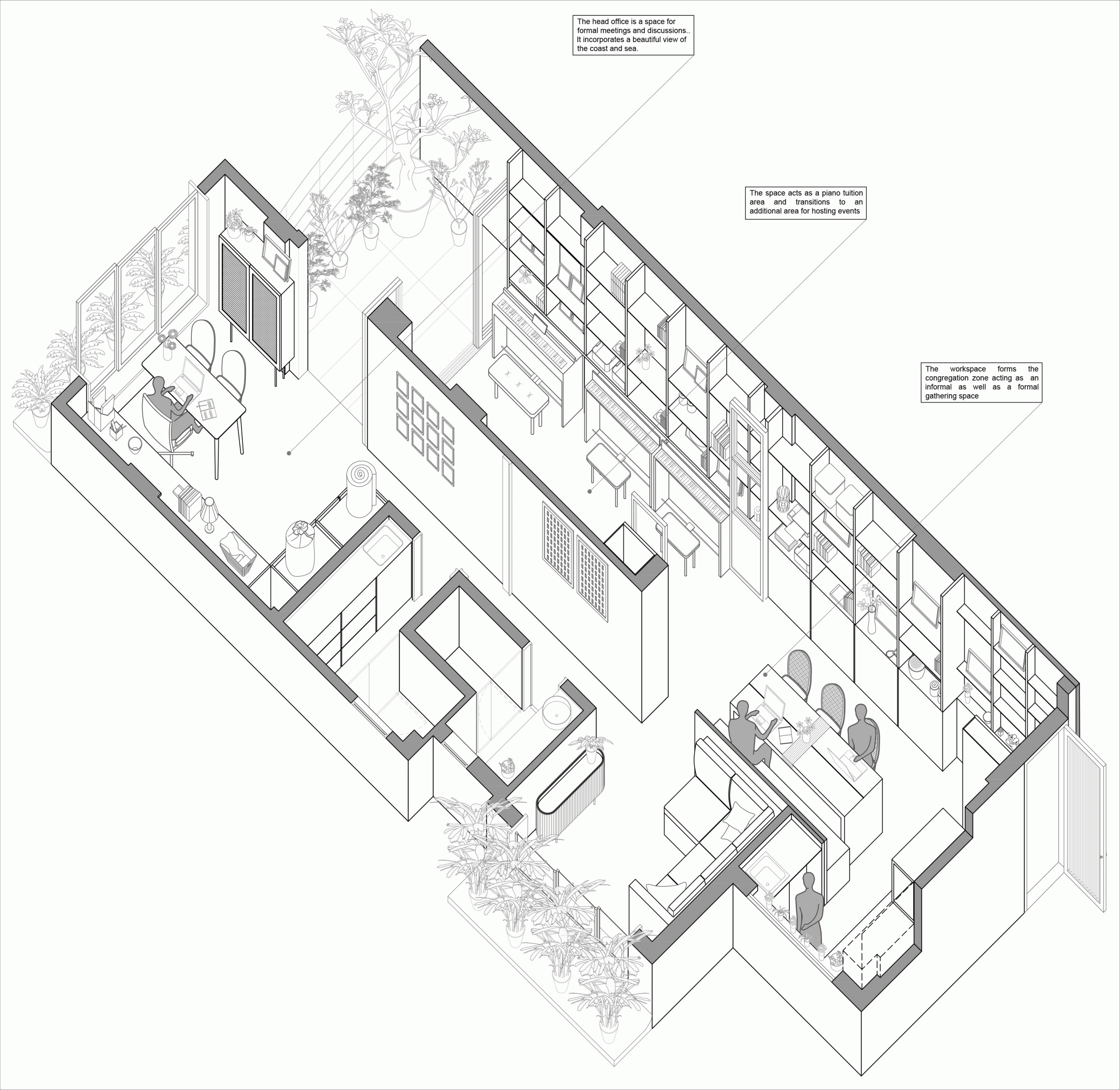
A complex programme that primarily
includes the architect’s own studio, a display-and-storage space for a home
linen brand and classroom space for a piano school set the tone for this
project. A second layer of complexity is added with the requirement for the
same space to also double up as an area for entertaining guests, host intimate
events and also serve as a residence when the need arises. These multiple
programmes with distinctly different user groups and timing of activation had
to come together and be achieved in a typical 2BHK apartment layout with
structural constraints.
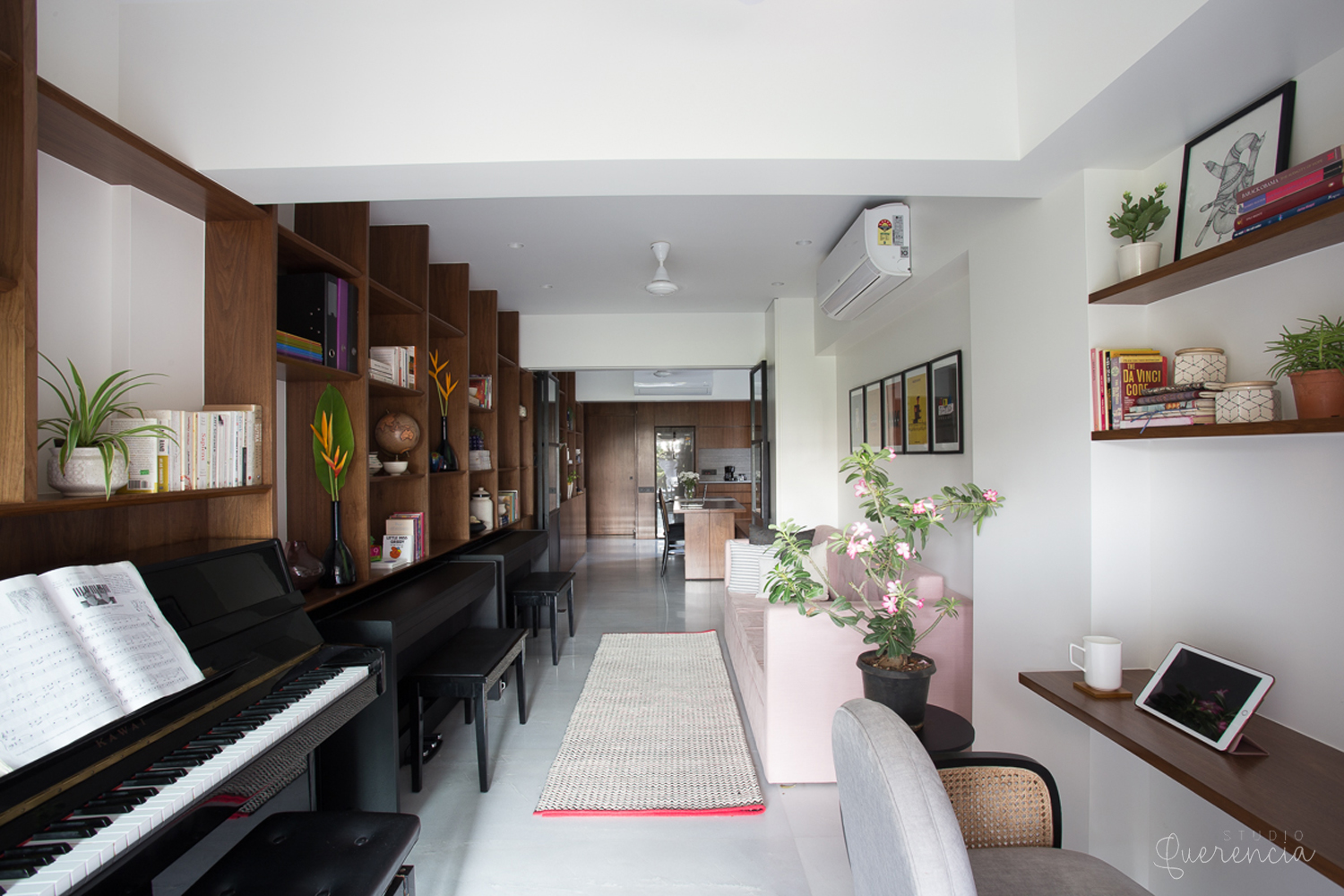
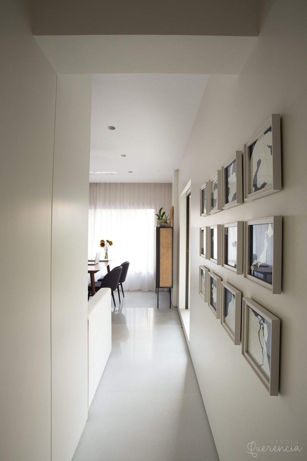
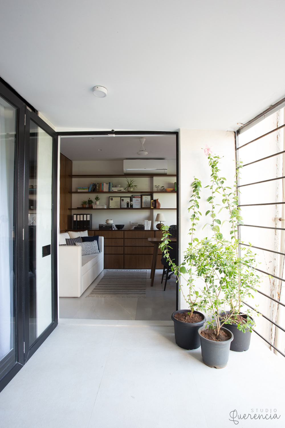
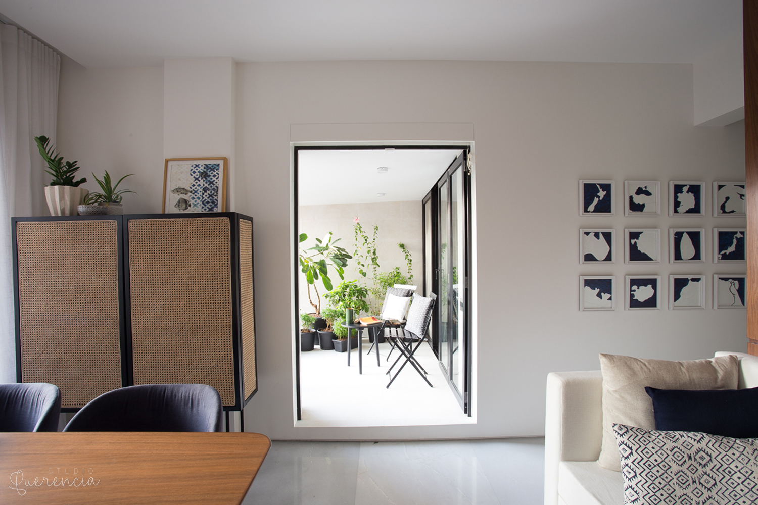
We began by stripping down all the
non-structural elements to envision the space as a whole. This allowed us to
bring in light and a distant view of the sea all the way towards the entry of
the project and formed the guiding principal for the design: to create zones
that are visually connected with each other, yet can function as distinct areas
with each affording their own degree of privacy when needed. Various
permutations of possible programmatic layouts were explored to finally arrive
at the one which worked the best while optimizing the available space.
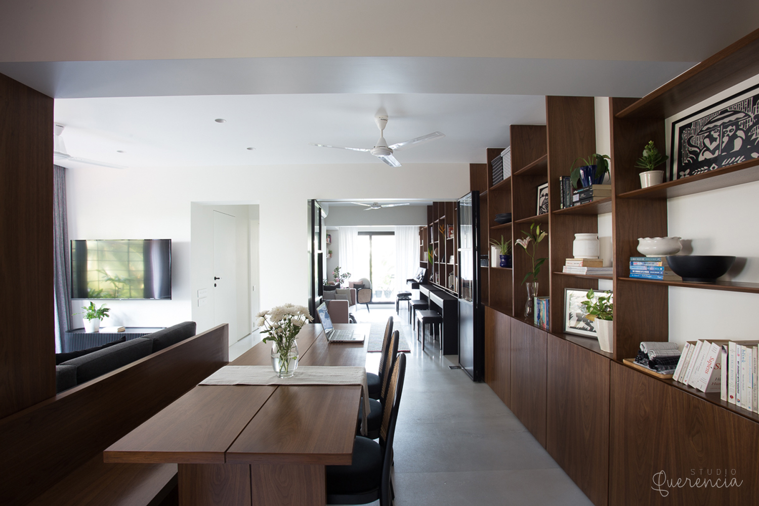
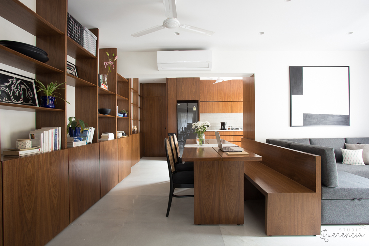
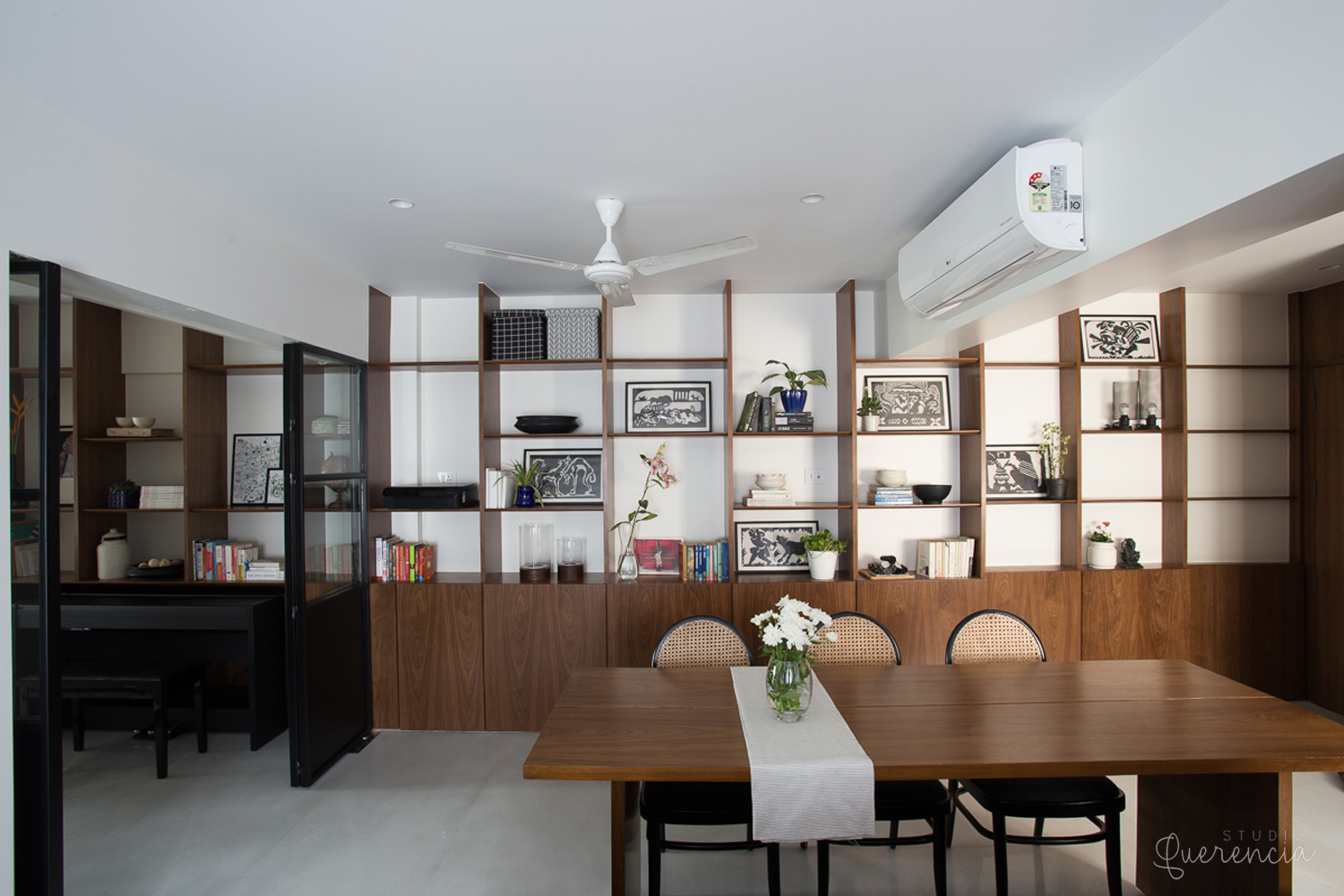
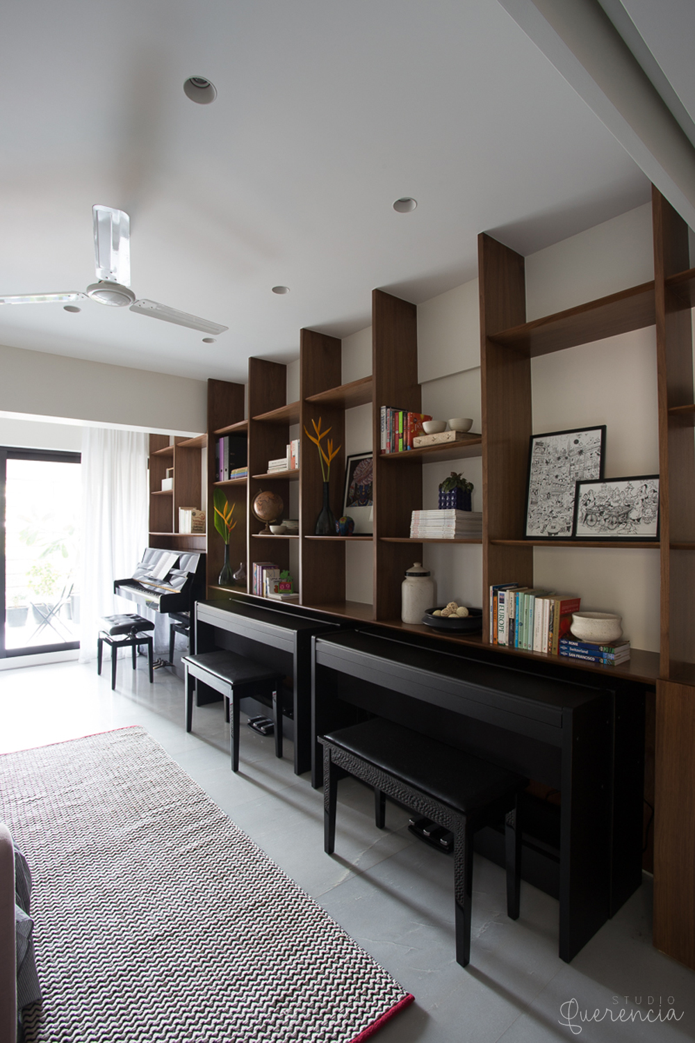
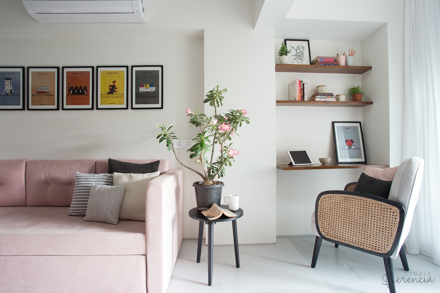
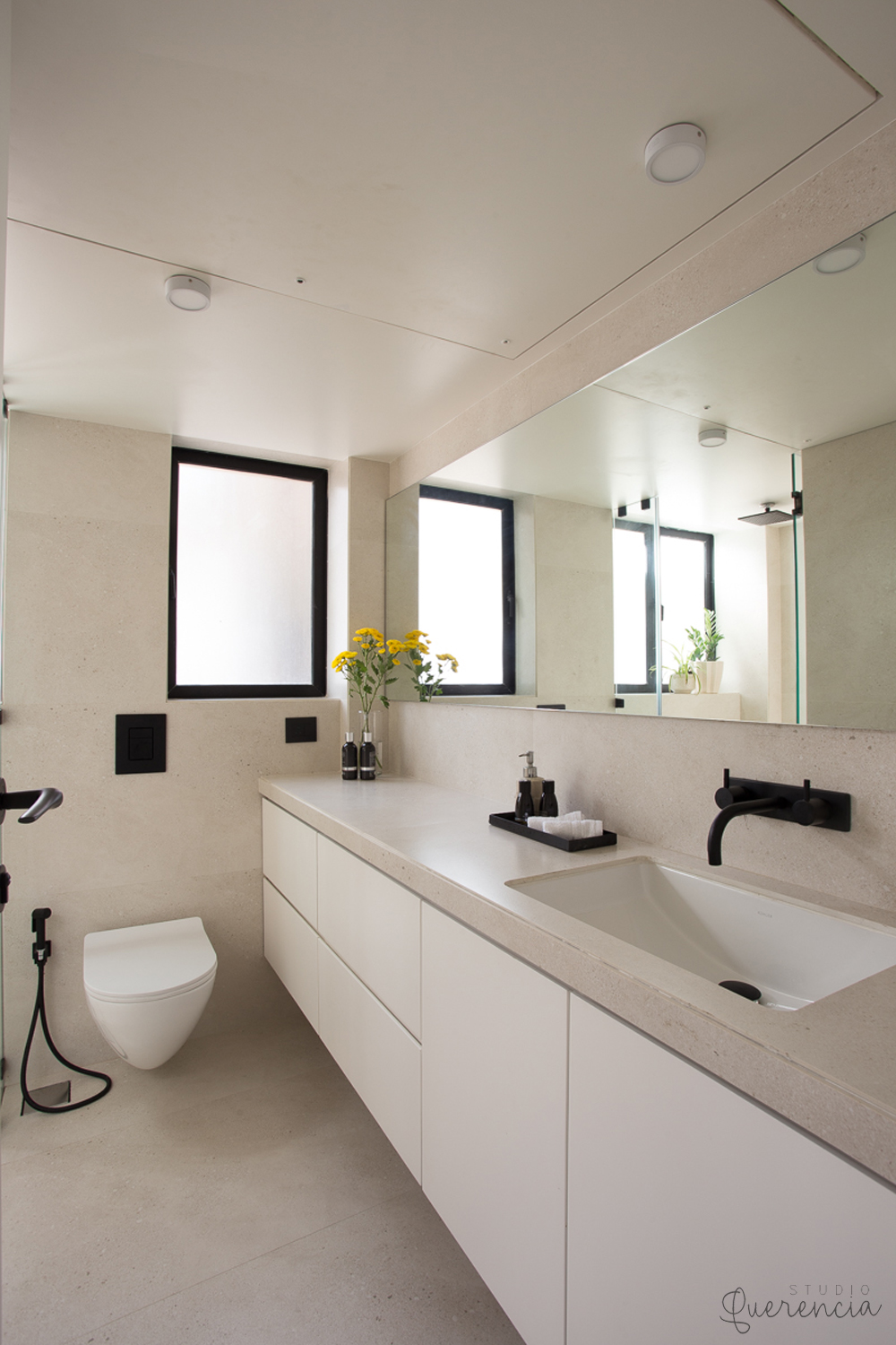
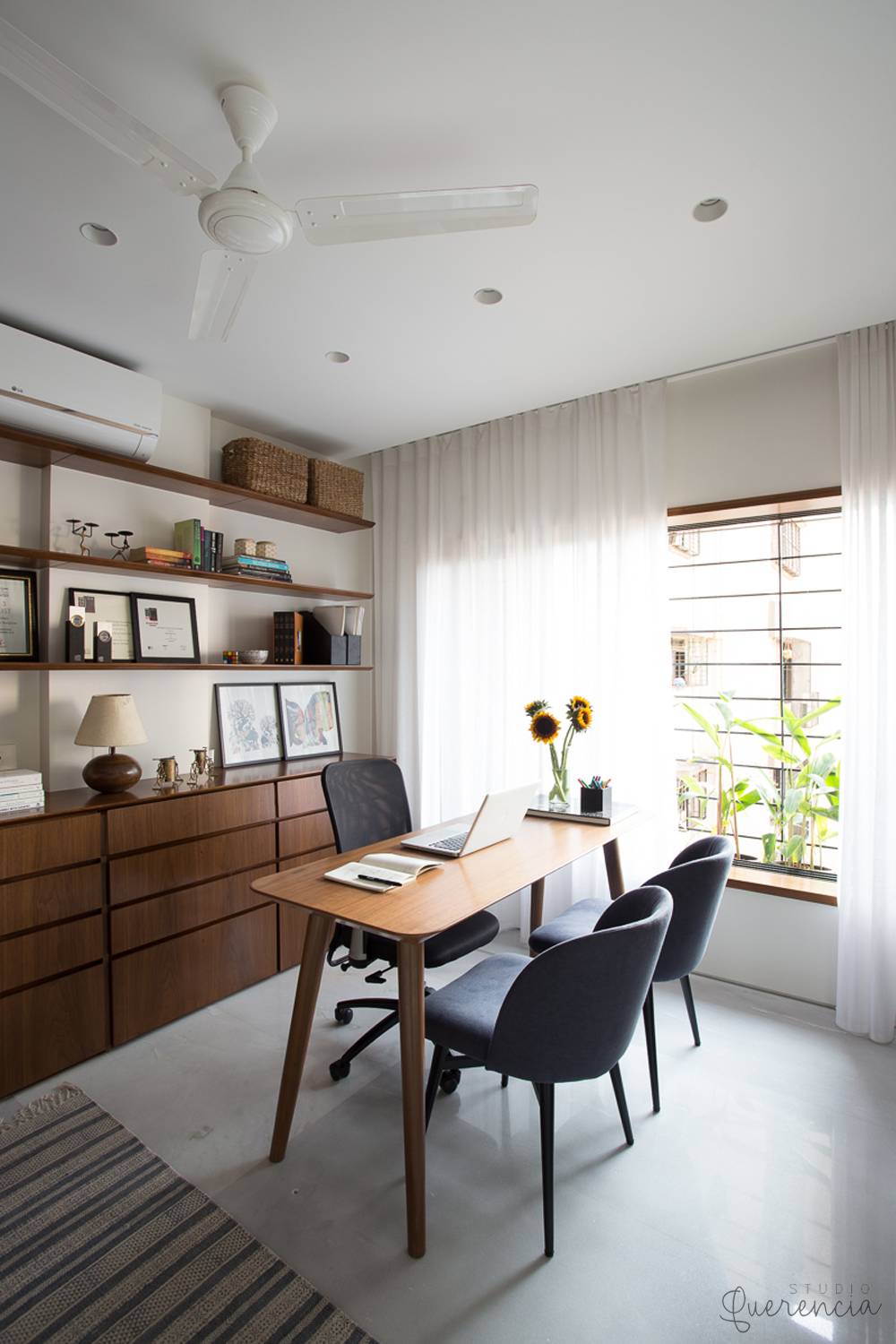
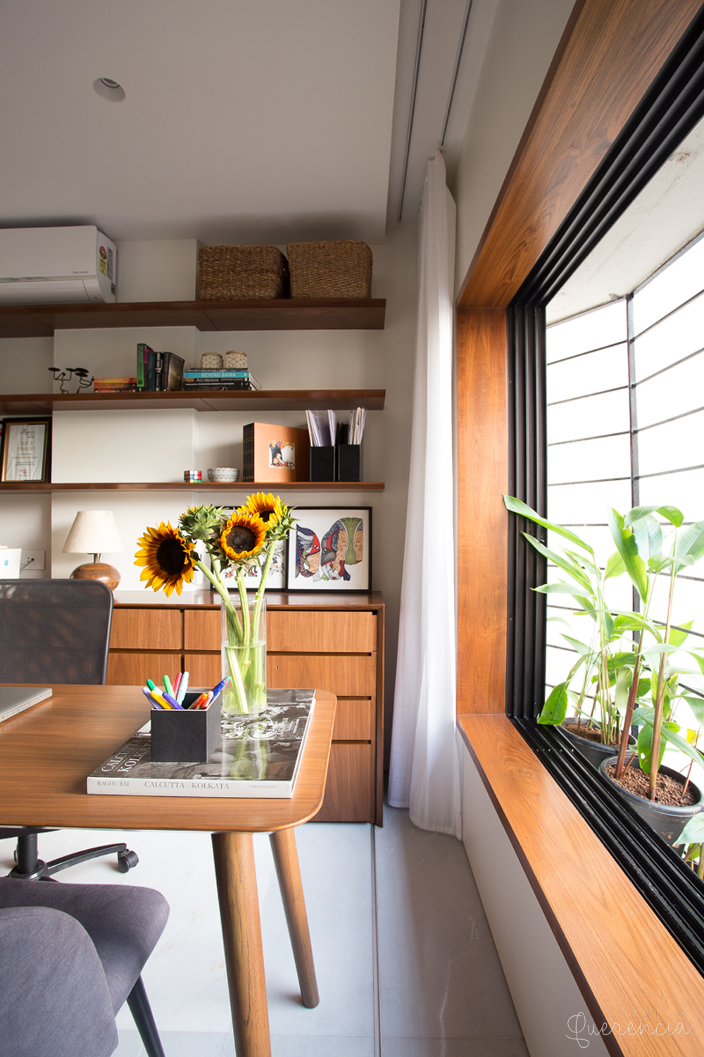
As for the material palette, we kept
it simple yet practical. A white Indian marble homogeneously runs through the
space with all carpentry expressed in a simple walnut veneer. This is then choreographed
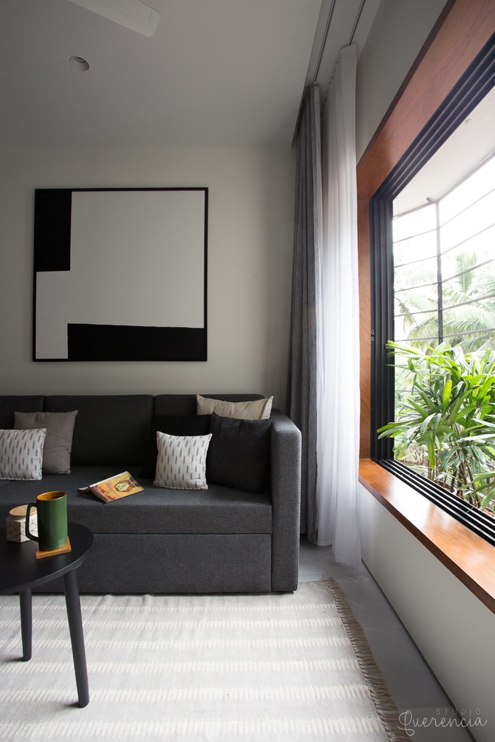
by accent furniture pieces through the space along with carefully curated
objects and artwork.